The Power of diffuse maps
This isn't really a tutorial just a study of one channel, diffuse. Which is the absorption of light. This tutorial is intended to be general in nature and is supposed to apply to almost every 3d package out there. Max users will have a problem understanding this because diffuse in 3dsmax is color. I don't know what they use for the channel that simulates the absorption of light. Every thing in this world has sort of a diffuse channel. Diffuse is responsible for the display color. Although in the computer generated world, you can go ahead and add a bump map, (which simulates depth on a pixel level which can be procedural) or even add a color map to give it some values of hue. But one of the most overlooked and most powerful channel in my opinion is the great diffuse. Using diffuse you and simulate shadows and any area you'd like. If any of you are keen of Radiosity also known as Global illumination, knows that this lighting technique adds the element of diffuse by bouncing light at all angles to give you the "best lighting situation". So certain areas that would naturally be hidden by an overlapping object gets shadow. Which is a great way of making something computer generated look real, or believable. One of the earliest cg shows that I know of was Beast Warz. For computer animators the show was a fun thing to watch and was evidence that cg is getting more popular in the film and television industry. I didn't really see too many episodes, but from what I saw it looked to fake. Which was probably due to bad lighting situations but I believe that alittle bit of diffuse would have help it a lot. Another newer cg show is Action Man, Starship Troopers, and Max Steel. Just by looking at these shows you will see a huge difference in quality. Its more tasteful and is full of light and shadow, unlike Beast Warz. So our universal goal in this world is to refrain from the Beast Warz "Look" and never look back.
So when you create a diffuse map keep in mind the areas that receive shadow. Good way to understand that is through example. A army of samurai is standing up over looking the horizon wile the sun sets. Just by reading that one sentence you get this picture in your head of all these soldiers. The most experienced 3d artist/Animators see more then just that. They see. The army for one, some un they're trousers, some wearing silk garments. Then the majority of them are wearing Heavy plated armor. Each piece of armor overlaps each other as the lay. Then if you dig deeper into the armor, you'll see that each plate has their own carvings and etchings. If you were to texture map the armor you would first thing you would think about is the relief it has. Parts are sunken in and other parts protrude outward. So below each piece that protrudes outward, assuming the light source is the sun, you would then paint about of dark gray under it. Then are render time it will appear darker then the rest of the armor.
Diffuse is also a great way of applying dirt to an object. by scattering black you can create variations in the map that would make it appear dirty. You can even use it to wear down certain areas. Like a mech for example. Around the areas where there are joints; you might want to add some dark shades to the diffuse channel on those areas. Or around the edges were friction occurs would be a area of wear. Thousands of ideas come to mind if you just think about the light source and predict possible shadows.
This first render is just of the color there are no bump or diffuse maps applied.
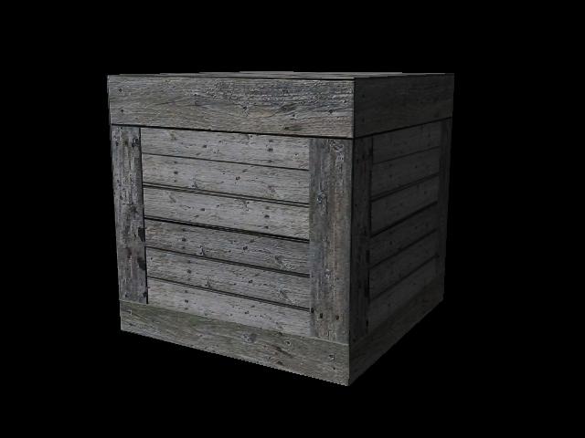
This next render below shows alittle bit of bump and the beginning of a diffuse map.
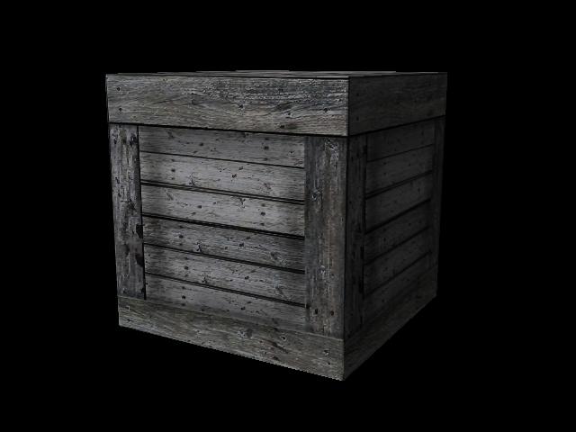
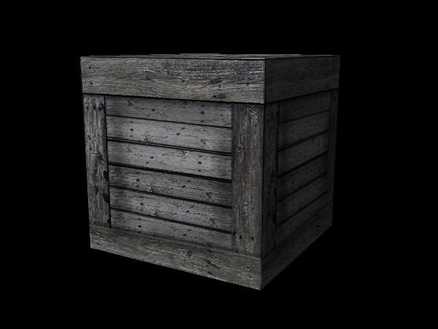
This render below shows the final Color, Bump, and Diffuse map that I used to create this image.
Here is the Texture I used to create the crate. Which can be taken be any digital camera or scanned in.
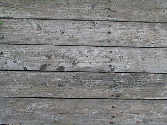
Now I'd like to talk alittle abit about how the crate was created. By the look of the final render it would seam like each board was modeled. Which is in fact false, all it really is, is a box. I'd show you the wire frame but you would be surprised to see a box. After I got the photo which could be of a bench out in the park a boardwalk near the beach or even a wooden fence. Either way this similar image is very easy to find. Next in photoshop I selected each piece of wood and put them in their own layer. rotated them duplicating them and flipping them over again. I even selected and copied some nail heads and placed them around to add more variation. It also a good idea to dodge and burn parts of it to add even more variation.
here's the file for ya if you'd like to see. cratemap.psd
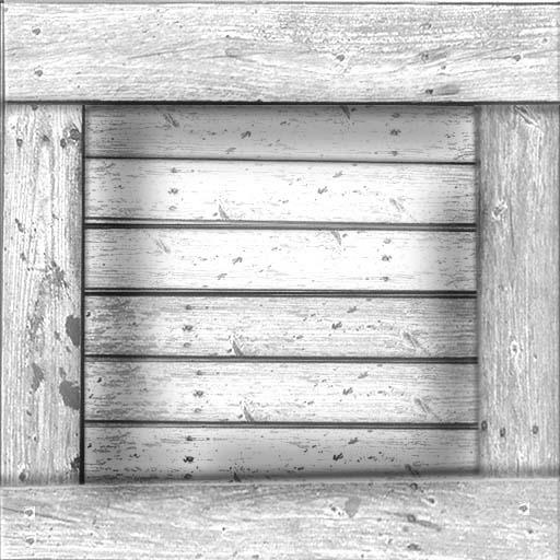
Flip through layers to see how they're assembled. to get a decent diffuse map flatten the image and goto mode then gray scale, then back to RGB. Next goto image adjust levels and move the arrow in the center to the left for make it lighter. You might want to experiment with it till you get what you want. It also to a good idea to add contrast to the image. Then save a copy as bump map. Take the images that doesn't have the contrast applied and mabey add a blur to it if its too sharp. Now this is where you have to think of where the shadowed areas are. Since the center of the crate. Where all the boards are horizontal would recede and the boards surrounding it on the edges are infront of it. So now with a soft bright and low pressure, paint in around the inside abit. Save and render. If you aren't happy with the simulated shadows go back and either lighten and darken areas till you get the proper effect.
Below I have a sample diffuse map.
That's all. I hope you realize the power of diffuse, good luck.